🚥 Service Map
.webp)
Once you properly set up your Cluster, Anteon automatically creates a service map for this cluster so you can easily get insights about what is going on in your cluster.
For example, you can easily find answers to the below questions:
- What is the average latency between service X and service Y?
- Which services have higher/lower latency than XX ms?
- What is the average RPS between service X and service Y?
- Is there a Zombie Service on your cluster?
- How much time does it take to run SQL queries?
- ... and more
Supported Protocols
Check Alaz.
Other protocols will be available soon.
Monitoring Your Service Map
Anteon makes use of eBPF to monitor the requests sent in your cluster so that you can get a better view of what happens in it without any code changes, service restarts and side-cars. Here’s how you can do so:
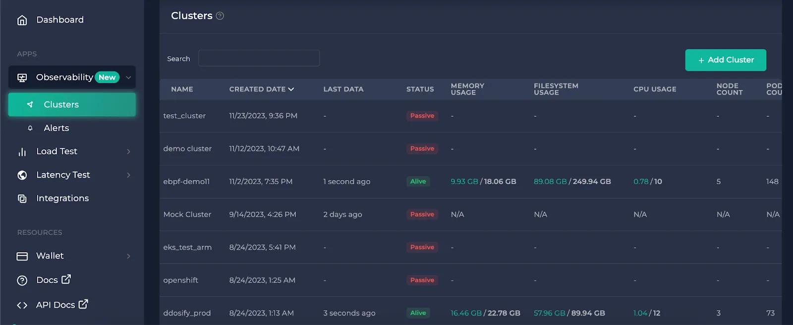
After you click on a cluster you want to observe in the clusters page, click on the service map tab. This will take you to the service map page.
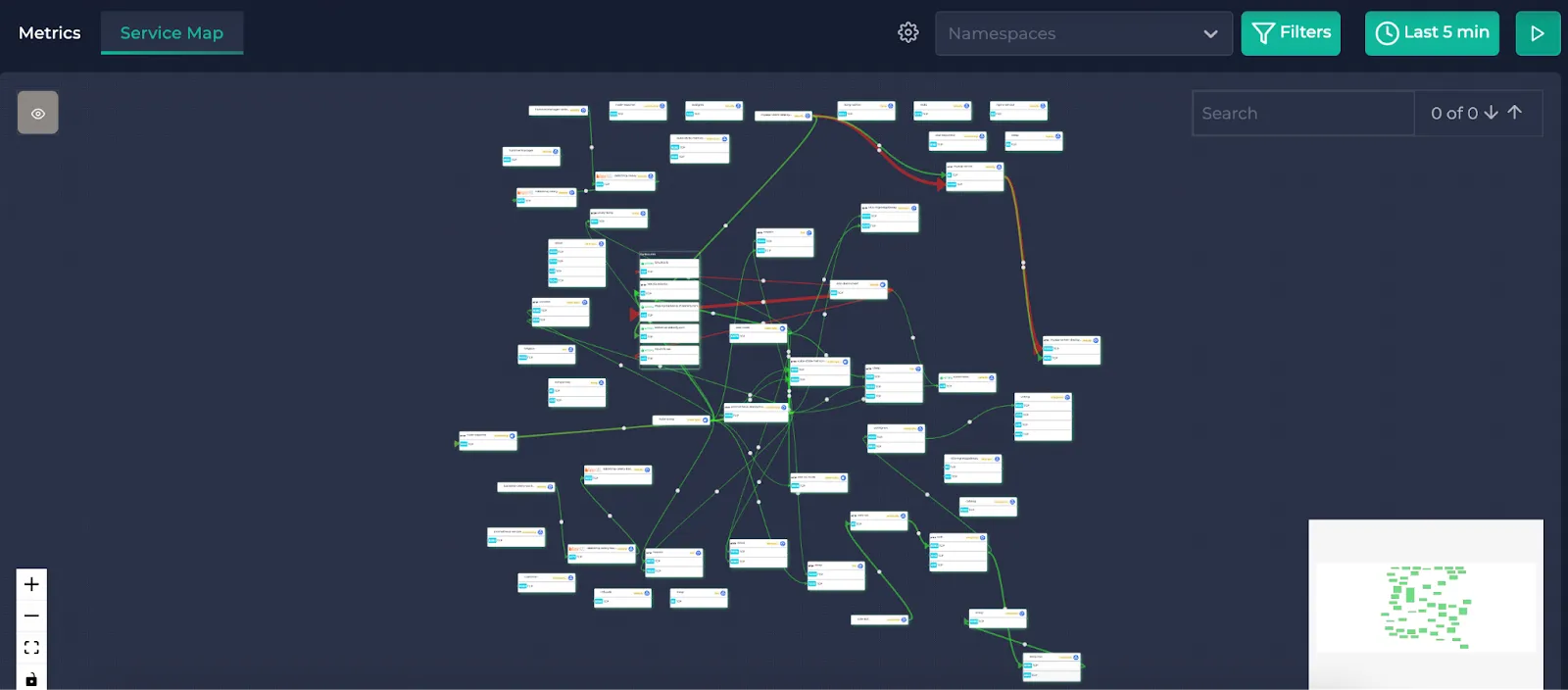
This is an example cluster service map page. If you haven’t completed the installation of Alaz, you will see this instead:
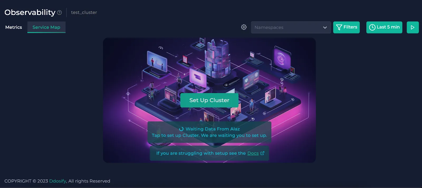
To complete your cluster installation, you can check the cogwheel button right next to the node selector dropdown or click “Set Up Cluster” on the center. This shows you the instructions to connect your cluster to Anteon through Alaz. If you need help on this, you can check the docs.
Filtering the data
Namespaces
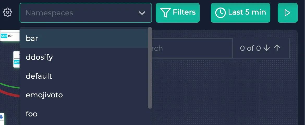
Here, you can pick the namespaces present in your cluster on the upper right corner to filter them.
Protocols, Status Codes, Latencies, RPS
You can use the filters button to filter out protocols, HTTP status codes and latency/rps values. HTTP status code filter only works for HTTP protocols and does not affect the other protocols. Here is the list of supported protocols.
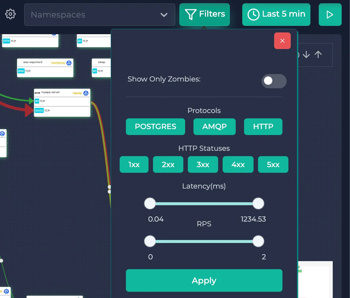
Each edge in the service map represents the total traffic sent/received between those two resources with all of the protocols combined. Edges are also distinguished by the receiving port of the destination resource.
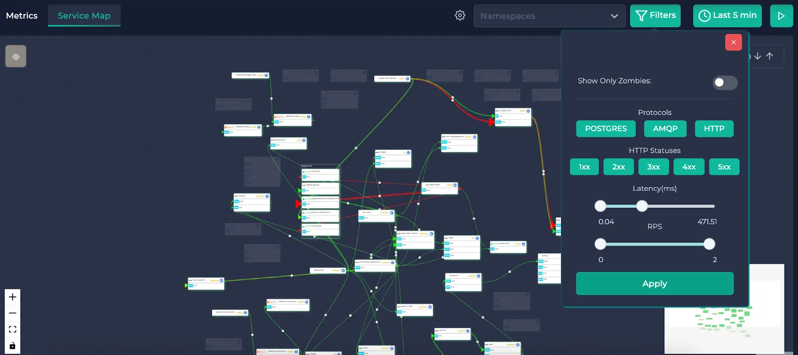
Here’s what it looks like when the filters are applied. The resources satisfying the filters are highlighted whereas the others are shadowed.
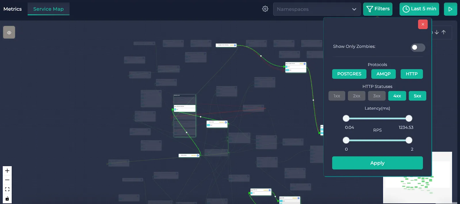
Note: The latency and RPS filters filter the endpoints (or the SQL queries depending on the protocol of the traffic) in the edges. It does not filter the edges. This means that an edge (with all the endpoints in it) could have an RPS of 100 but an endpoint in it could have an RPS of 1.5. This filter looks at all of the endpoints in the edge and highlights it if a single endpoint satisfies the selection. If none of the endpoints satisfy the conditions, a shadow is applied to the edge. The same goes for the average latency. This allows you to detect bottlenecks in the traffic while still being able to see the total RPS and average latency of the edge.
You can also click on the “Show Only Zombies” option to highlight the Kubernetes resources without any traffic. Selecting this disables the other filters.
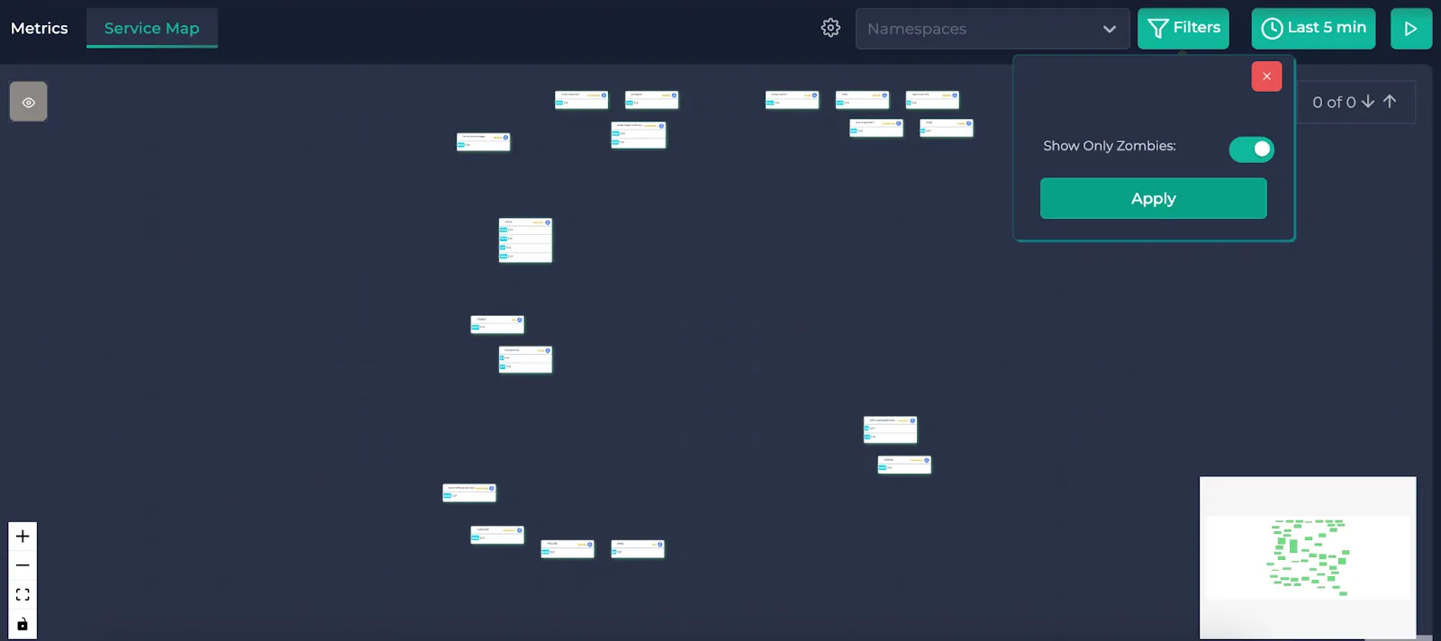
Here are the zombie resources of the service map. These are the resources that do not have any traffic related to them.
Time intervals
You can also use the time selector in the same upper right corner. You can either specify one of the predetermined time intervals on the right or you can specify your custom time interval:
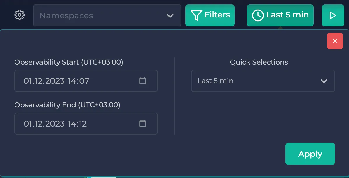
Note: The service map page is reloaded at about every 5 seconds. If you wish to observe an instant, you can pause the page from the play/pause button on the upper right corner. After you are done, you can enable the reloading by clicking on it again.
Searching
If you want to look for specific resources, you can use the search bar. This highlights the matching resources with yellow and autofocuses on them. You can check the next/previous matches with the arrow buttons or by pressing Enter:
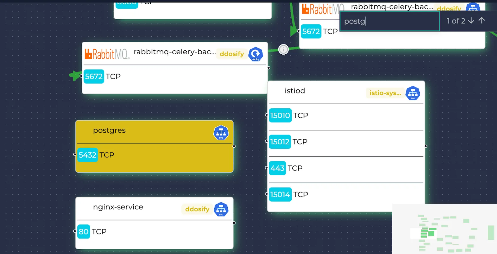
Navigating through the service map
Edges
The requests sent between resources are represented by arrows/edges. The thickness and the colors of these edges depend on the average latencies and total RPS of them. To learn more, you can click on the eye icon on the upper left corner. While red colors represent higher latencies, thicker edges represent higher RPS values.
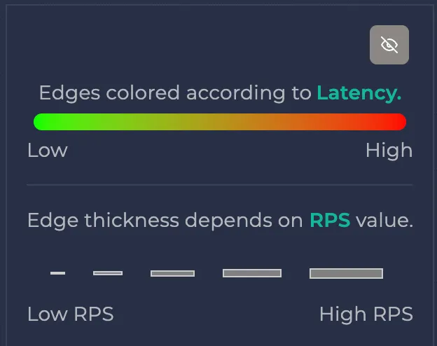
The edges are drawn from the source resource to the receiving port of the destination resource. When drawing the edges, the outgoing contact points are always the right center of the resource but the receiving contact points are determined by the receiving ports. This is because requests could be sent by any port whereas they are received only by specific ports.
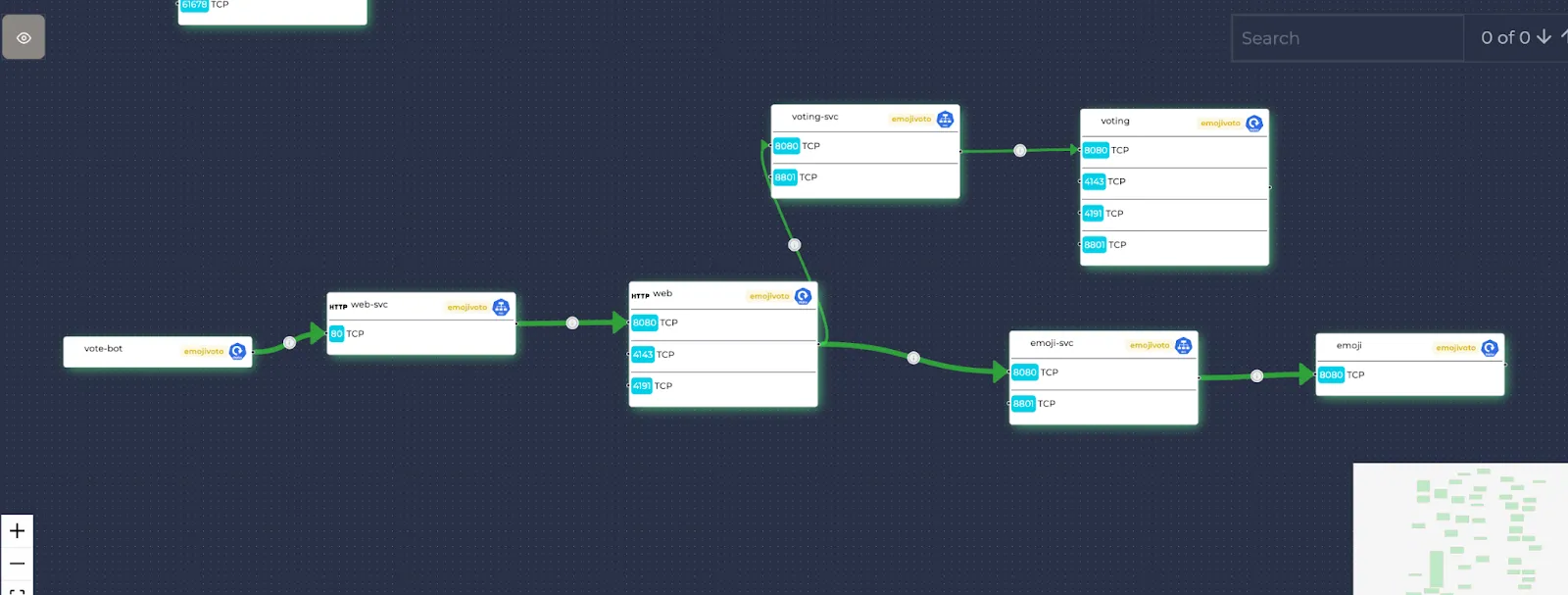
Note: To ensure the stable performance of the service map, a resource limit is applied when returning the data. Currently, this limit is set to 50. When this number limits your service map visualization, you are notified at the top of the page. If you cannot see some of the desired resources, you can apply namespace filtering to narrow down your results.
Note: To be able to draw an edge on the service map, both the source and the destination resources should be present. If at least one of them is not drawn (due to resource limiting or filtering etc.), the edge cannot be drawn either.
You can also use the minimap on the bottom right corner to navigate through the service map.
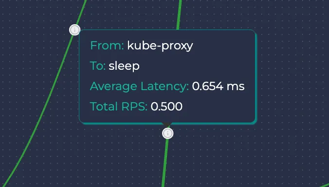
If you hover on the information button of an edge, you can see the source and the destination resources, the average latency and the total RPS of that edge.
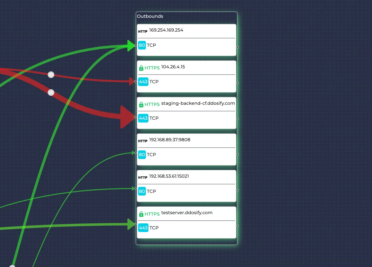
If there is traffic sent to outer resources that are not present in the cluster, they are denoted as outbounds. They do not have namespaces and Kubernetes resource types.
Resources
Let’s also learn what each icon/text means in a resource:

In the header of each resource, these are written respectively:
- The most prominent protocol of the resource (if applicable)
- The name of the resource
- The namespace of the resource
- The symbol of the resource type (Pod, Deployment, DaemonSet, etc.)
The symbol of the resource type can be seen in more detail while hovering over it:
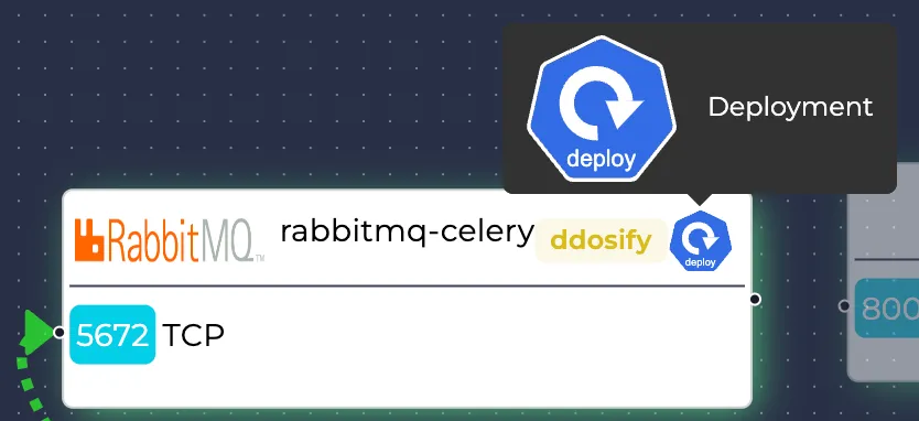
Each resource's receiving (port, protocol) pairs are also written on them.
Monitoring individual resources
You can click on the resources to learn more about them. There can be at most three tabs for a resource:
- Summary
- Resources (applicable only if that resource manages other smaller resources, like ReplicaSets for Deployments)
- Metrics (applicable only if that resource receives traffic)
Summary
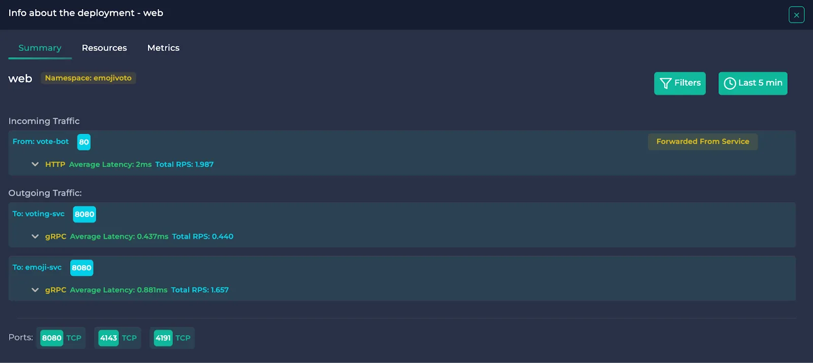
Note: Services point their received traffic to other resources. This means that these traffic data are also present in the pointed resources and are denoted by “Forwarded From Service”. They are also written in the outgoing traffic section of the pointing Service and denoted by “Forwarded To Deployment/DaemonSet” etc.

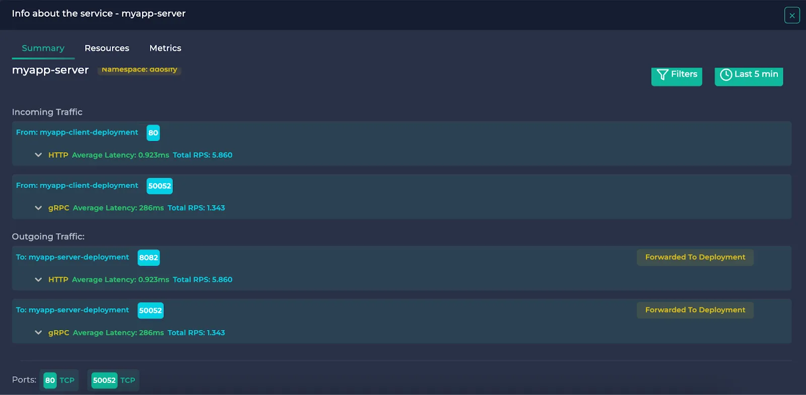
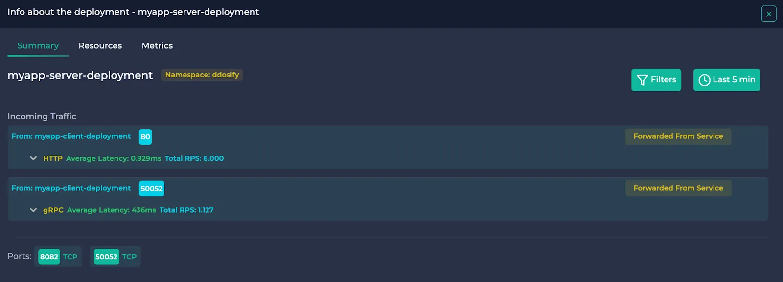
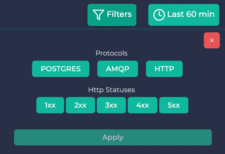
In this section, you will see the name and the namespace of the resource, incoming/outgoing traffic and the used ports. If you wish to filter the traffic data, you can click the “Filters” button on the right to use protocol and HTTP status code filters. After you click “Apply”, only the traffic satisfying the conditions will be visible.
Note: HTTP status filters only work for HTTP and HTTPS protocols. They don’t have any effect on other protocols.
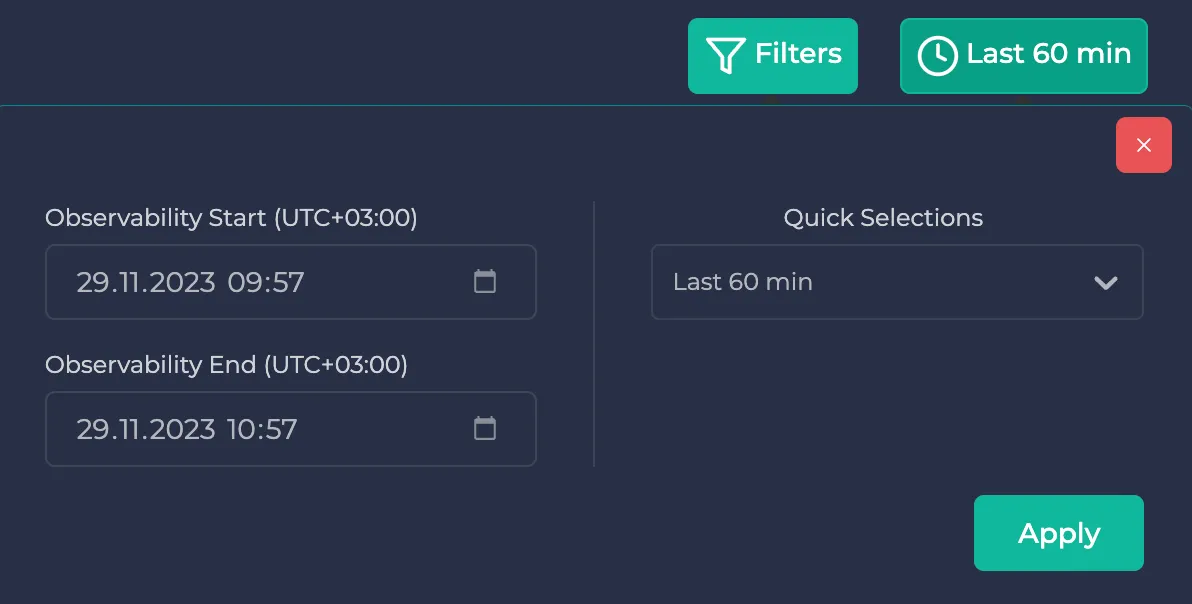
If you wish to specify a time interval, use the button next to the filters. Here, you can either specify one of the predetermined time intervals, or you can specify your custom time interval:
In each traffic object, the other resource (sending resource if the traffic is incoming, receiving resource if the traffic is outgoing) and the receiving port of the receiving resource is written. Then, the traffic protocol is written alongside average latency and total RPS. If you wish to learn more about this traffic, you can click on it.

Here, you can view individual endpoints belonging to this traffic alongside their average latencies and total RPS. You can use the page buttons to navigate if there are more than five endpoints.

If you click on the methods, more details are shown, such as status codes and latency/RPS information of them:

If you are viewing Postgres traffic, the endpoints turn to queries. Here, if you click on the type and then on the query, you can examine the query up to a character limit.
Note: Literal values inside the Postgres queries are turned to placeholders.
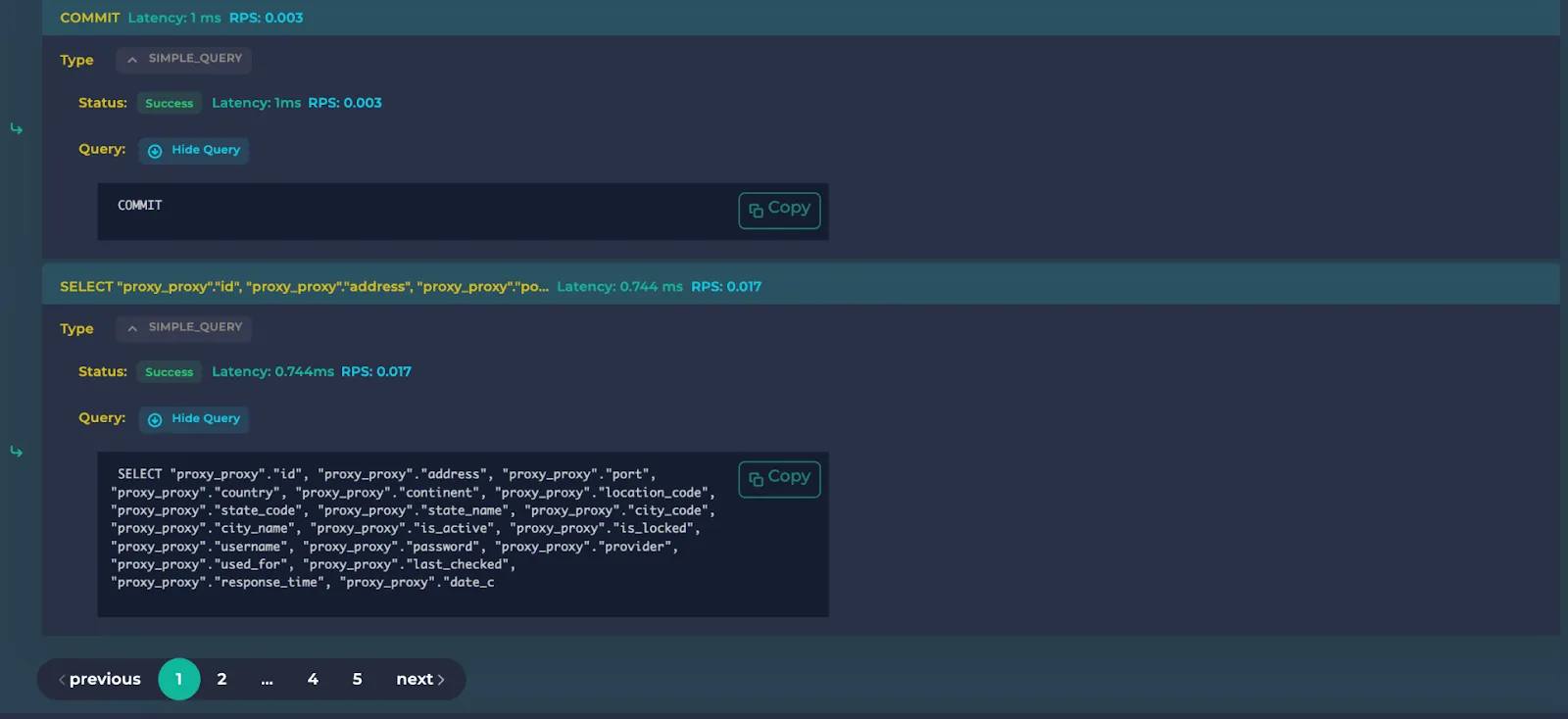
A helpful way to understand which endpoints respond the slowest or take up most of the traffic is by using the sorting option in the upper right. Here, you can sort by latency or RPS and sort with descending or ascending.
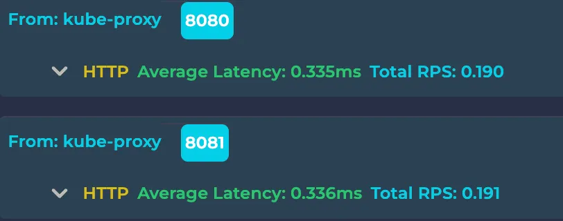
Note: There is a traffic object per each (resource, port, protocol) tuple. For example, in the below example, there are two traffic as their receiving ports are different:
Resources
This section is only applicable to Deployments, Services and DaemonSets. It shows the inner resources of the selected resource. This means ReplicaSets for Deployments, Pods for DaemonSets and Endpoints for Services. Here are some examples:
Deployment:
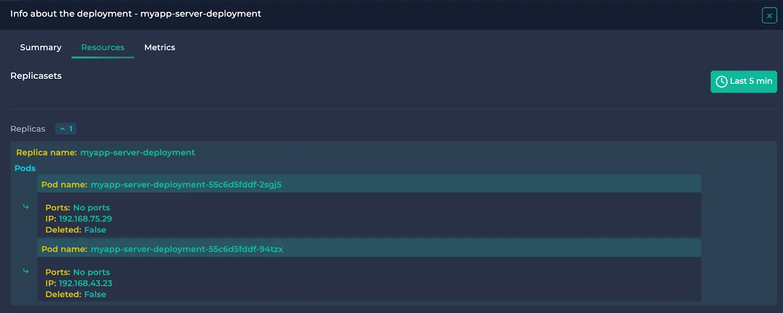
ReplicaSets belonging to the Deployment are written alongside their Pods.
Service:
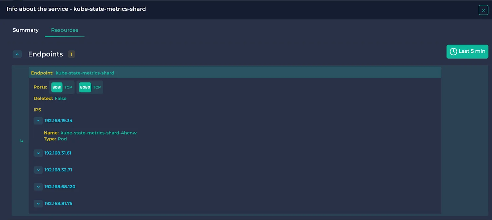
Endpoints, their ports and the resources they point to are written.
DaemonSet:
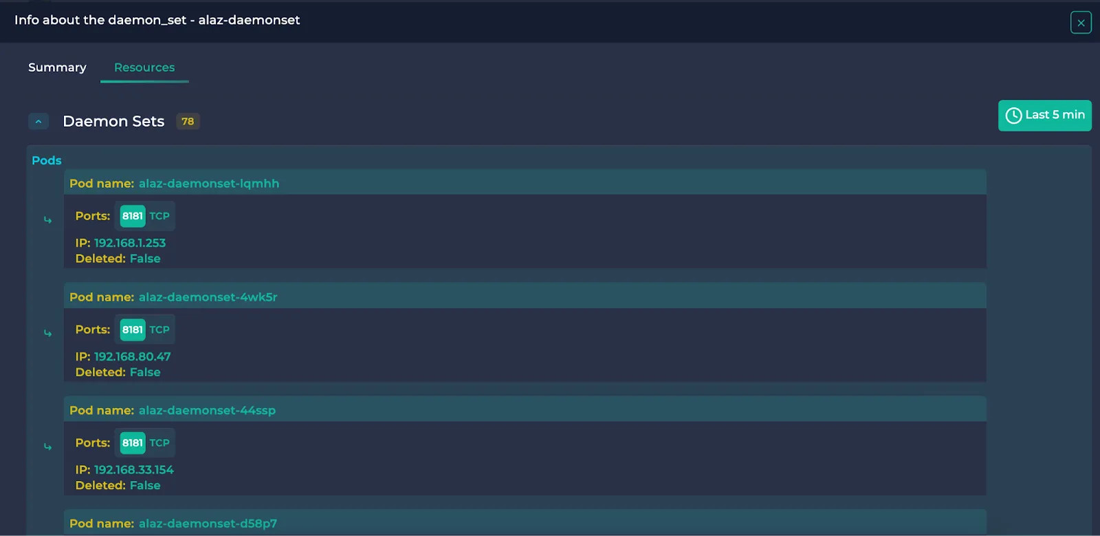
Pods belonging to the DaemonSet are written.
Metrics
Note: This section is only available for resources receiving traffic.
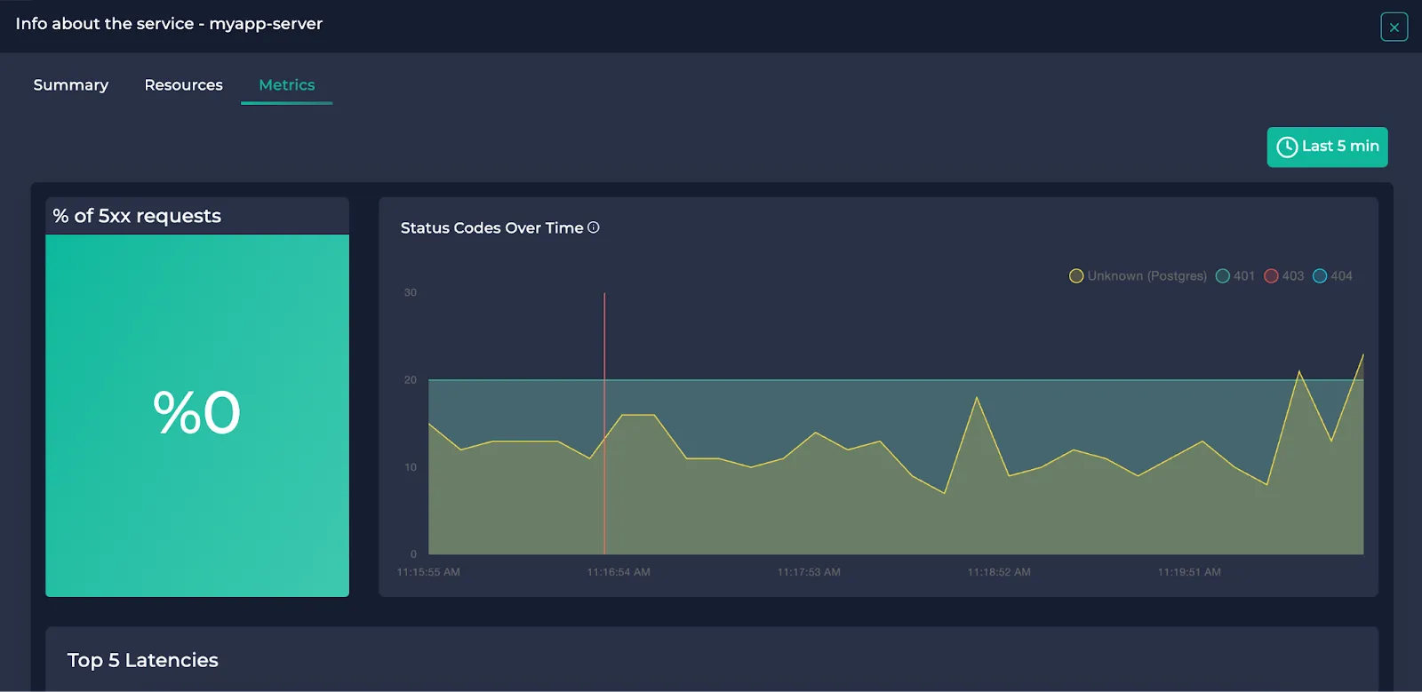
Here, you can view the following:
- The percentage of the requests ended up with 5xx status codes (only if HTTP/HTTPS).
- The distribution of the status codes over time (0,1,2 if Postgres)
- Endpoints (queries if Postgres) with the top 5 average latencies
- Endpoints (queries if Postgres) with the top 5 RPS
You can also specify a time interval of your choice on the upper right. You can either specify one of the predetermined time intervals on the upper right or your custom time interval.


In the top 5 latency/RPS sections, you can also filter protocols and/or search among them:
.webp)
If you require assistance with monitoring your service map, you can join our Discord or send an email to support@getanteon.com.